Stessa
Design System build
Evolving the core experience while introducing strategic new capabilities
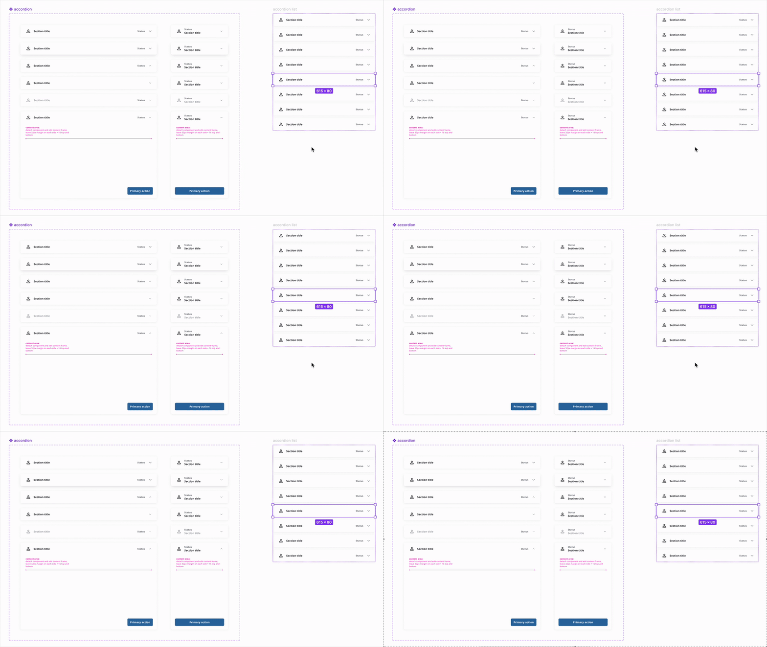
Accordion component demo
Overview
Stessa is a one-stop shop for all things related to property management. Initially a finance management tool, Stessa has now expanded to cover document uploads, auto-imported tax records, lease and tenancy details, and more.
As a Senior Product Designer, I developed an enhanced, scalable design system for cross-platform use. Our current design system was only partially established and was missing core components such as secondary colors and components that allowed for more complex development.
Design Principles
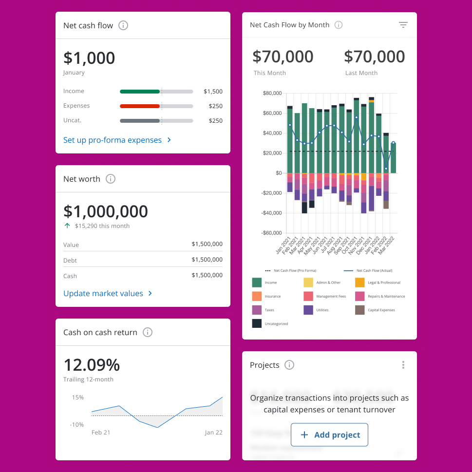
The redesign focused on integrating new essential functionalities, such as tracking monthly expenses and renovation projects, while simultaneously modernizing our design system. My goal was to create a dashboard that was not only functionally richer but also highly responsive and scalable to support our product's future growth.
Our user base was diverse, ranging from individuals with a single investment property to "super users" managing hundreds. This spectrum of users presented a challenge in catering to varying levels of tech savviness and different paces of property acquisition. The business goal was to enhance user engagement and provide more comprehensive financial insights, ultimately empowering users to better manage their portfolios. There were no specific constraints beyond maintaining a high-quality user experience during the integration of new features.
Brand Colors
Stessa is a subsidiary of Roofstock, so we require our own design system and brand design. We made sure that the colors we chose passed accessibility requirements and were flexible enough to use across the whole app.
Typography
Our user base had a range of ages and tech-savviness, so it was important that our app was easy-to-read. We chose the font ‘Open Sans’ for its legibility and versatility.
Components
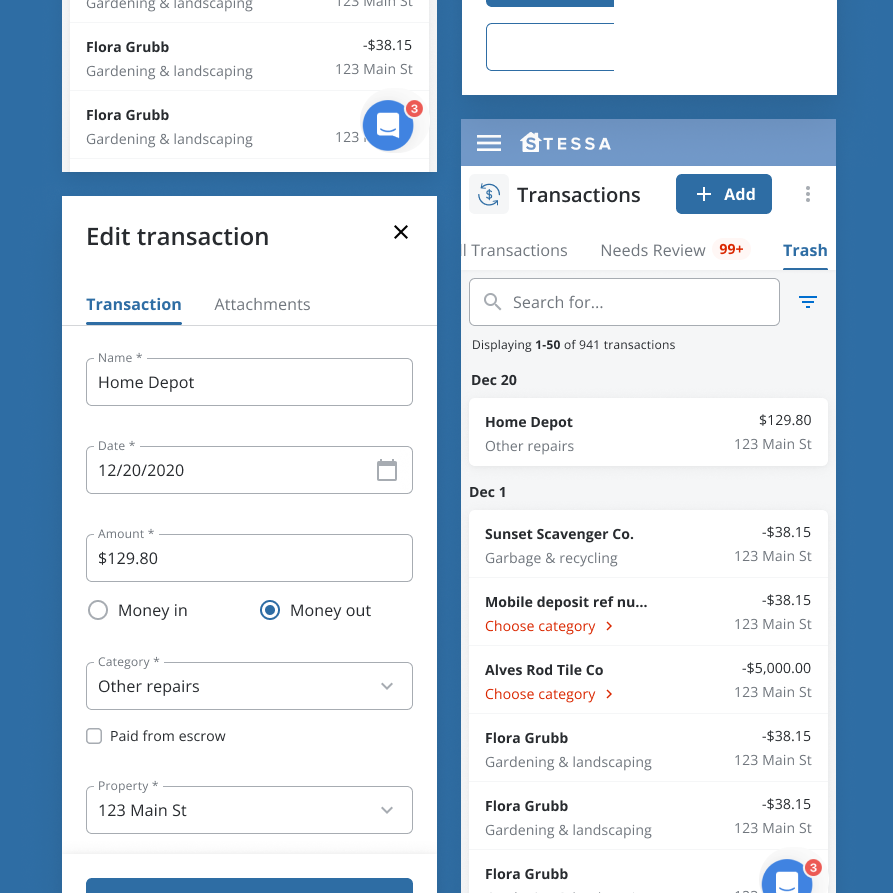
Our previous components didn’t allow for further expansion of the product; we were constantly having to develop new ways to integrate functions into our existing designs. In order to combat this in the new design system, we began creating components that were clearly documented and made for different viewports, then thinking ahead to more advanced functionalities and allowing for new components to accommodate these. For example, our lightbox component has the ability to show the gallery function “View All,” but this is a boolean and many of our lightboxes have the simplified version and don’t require this mechanism.
Components included:
- Primary and secondary buttons, text buttons, and links
- Complex dropdowns
- Table components (e.g. in Transactions)
- Custom icons
- Primary and secondary navigation
- Search bar and filters
Final documentation
From user research to ux design, see how I explore the creative process.
More projects