Stessa
Dashboard refresh
Evolving the core experience while introducing strategic new capabilities
Prototype demo
Overview
Stessa is a one-stop shop for all things related to property management. Initially a finance management tool, Stessa has now expanded to cover document uploads, auto-imported tax records, lease and tenancy details, and more.
As a Senior Product Designer, I led the redesign of our app's core dashboard, the central hub for investors to track their real estate property performance. This project was critical because the dashboard is the first experience users have when using our app, and directly impacts their ability to make informed decisions about their investments.
Discover
The redesign focused on integrating new essential functionalities, such as tracking monthly expenses and renovation projects, while simultaneously modernizing our design system. My goal was to create a dashboard that was not only functionally richer but also highly responsive and scalable to support our product's future growth.
Our user base was diverse, ranging from individuals with a single investment property to "super users" managing hundreds. This spectrum of users presented a challenge in catering to varying levels of tech savviness and different paces of property acquisition. The business goal was to enhance user engagement and provide more comprehensive financial insights, ultimately empowering users to better manage their portfolios. There were no specific constraints beyond maintaining a high-quality user experience during the integration of new features.
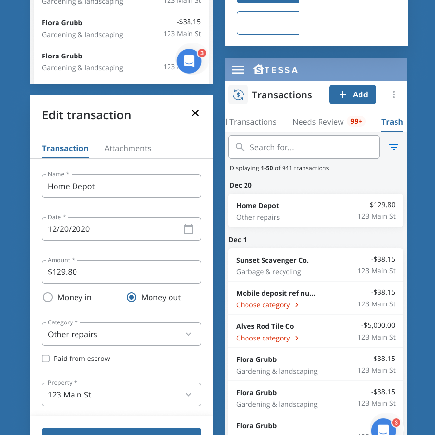
We had an existing Transactions page that was archaic and built from when Stessa first launched. Needless to say, it was outdated in both functionality and code. This meant that the app was missing features and style parity. Upon conducting 10+ user interviews and having an open stream of feedback with our customer support agents, we uncovered pain points and areas for improvement in our existing product.
Define
The existing dashboard, while functional, lacked several key features that our users needed to effectively manage their investments. This led to users seeking external solutions or manually tracking critical financial data, fragmenting their experience.
★ Missing Core Functionality: Users needed to track monthly expenses and home renovation projects directly within the dashboard, which was not supported by the existing design.
↕️ Limited Scalability: The current components were not designed to be responsive, creating inconsistencies across different devices and limiting our ability to scale the product for future features.
📊 Incomplete Financial Overview: Without a centralized view of all financial data, users struggled to get a complete and accurate picture of their property performance.
Problem statement
Currently, real estate investors find it difficult to view data analytics of their finances. This is because the old designs are hard-to-read and unclear. As a result, they experience frustration and are less likely to input information in order to get their data results.
Develop
To understand user needs and pain points, I conducted extensive qualitative research. I interviewed over 10 users, asking about their current property management workflows, what financial metrics were most important to them, and what functionalities they wished the app had.
Key insights included:
- Users manually tracked expenses in spreadsheets, highlighting a critical need for integrated expense management.
- Many users were actively undertaking renovation projects and desired a way to track the costs and progress associated with these investments.
- Regardless of property count, users wanted a clear, at-a-glance view of their net cash flow and overall net worth
- The desire for data visualization was strong, particularly for understanding trends in monthly cash flow.
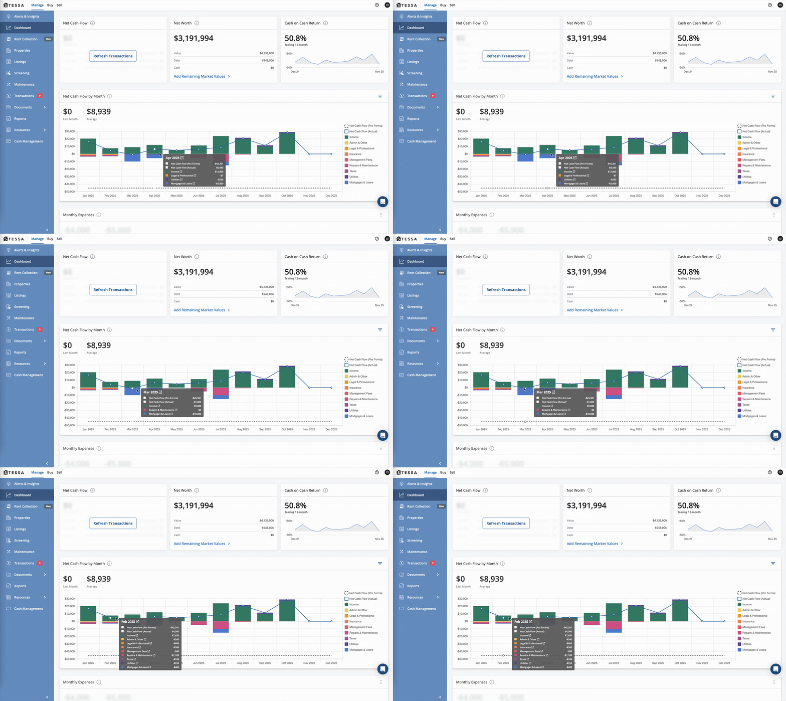
The redesigned dashboard provides investors with a comprehensive and intuitive overview of their property performance, integrating critical financial metrics and project tracking.
Features and design decisions included:
- Centralized Financial Metrics: Prominently displaying Net Cash flow, Net Worth, and Cash on Cash Return as key performance indicators (KPIs) at the top for immediate insights
- Monthly Net Cash Flow Graph: A clear, interactive graph that allows users to quickly identify trends and understand financial performance over time.
- Integrated Monthly Expenses: A dedicated section for users to monitor and identify areas for optimization. This also introduced the ability to categorize expenses, adding valuable detail.
- Renovation Project Tracking: A new module that allows users to track the status, budget, and expenses associated with their home renovation projects, providing a holistic view of their property investments.
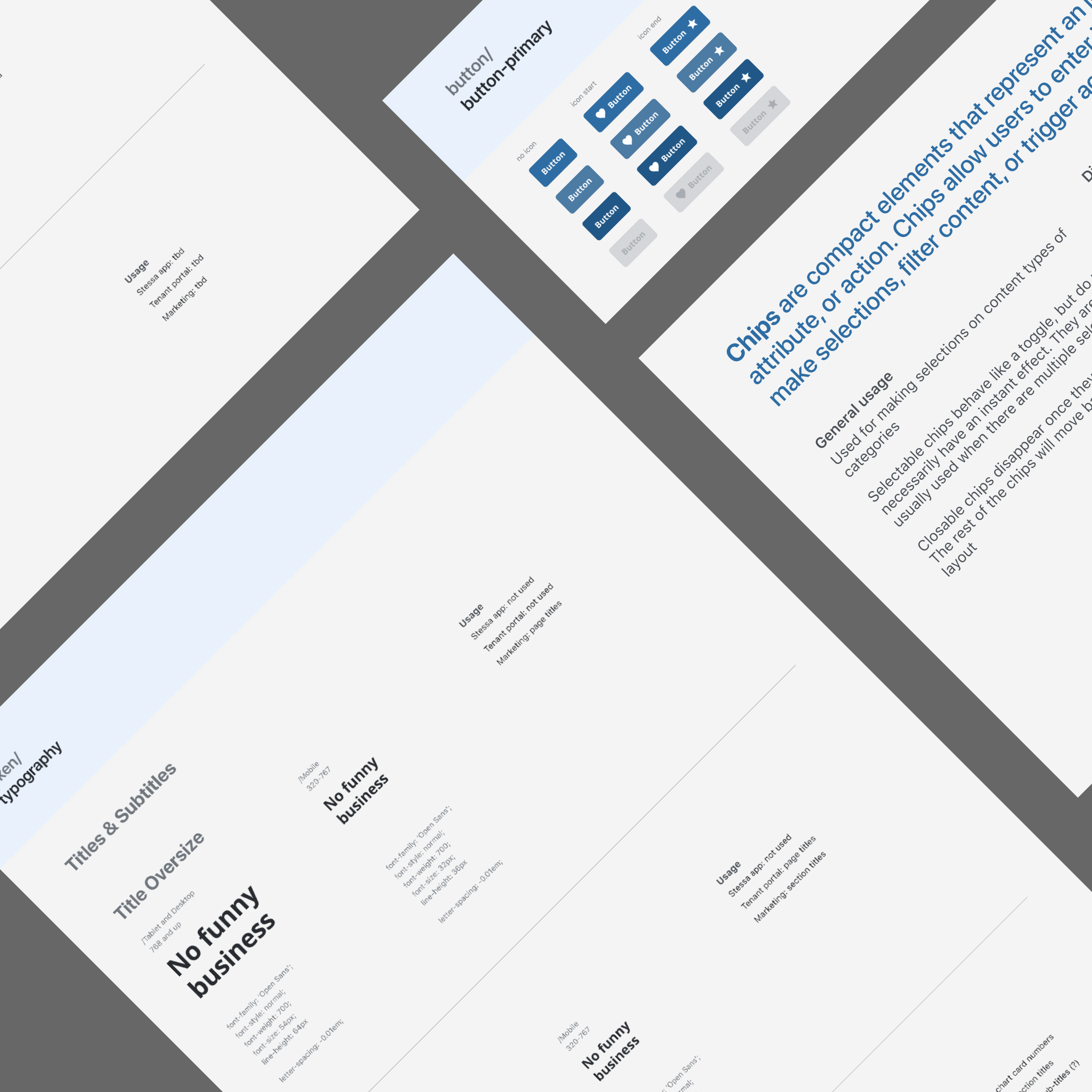
- Refreshed Component Library: All dashboard components were redesigned to be fully responsive and scalable, ensuring a consistent and optimal experience across various devices and preparing the product for future feature additions.
“The new dashboard is user-friendly and easy to understand
Deliver
The dashboard redesign significantly improved user engagement and data quality within the application.
⬆️ Increased User Engagement & Satisfaction: The introduction of highly requested features like bulk editing and advanced filtering directly improved user satisfaction and reduced friction in managing finances.
⬇️ Reduced Support Inquiries: By providing clear, intuitive tools for common tasks, we decreased customer support tickets related to transaction management.
↗ ️ Improved Data Quality & Accuracy: Easier categorization and reconciliation tools led to more accurate financial data within the app, benefiting users who rely on Stessa for reporting and tax purposes.
This project reinforced the importance of continuous user feedback loops, even for foundational product areas like a dashboard. A key learning was that while adding new features is crucial, ensuring the underlying components are robust and scalable is equally vital for long-term product health.
If I were to approach this project again, I would consider introducing A/B testing for different dashboard layouts to further optimize information hierarchy for diverse user segments. Future steps for the dashboard include exploring more advanced customization options for "super users" and integrating predictive analytics to offer even deeper financial insights.
Reusable and responsive components
From user research to ux design, see how I explore the creative process.
More projects